
The challenge of creating a poster for an exhibition of Christiane Kernen and Huguette McCluskey-Cavin bringing together sculpture and painting in one image.
Estimated reading time: 3 minutes
The challenge
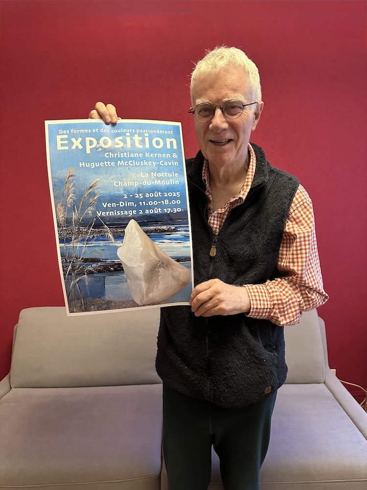
Creating a poster for an exhibition of a painter and a sculptress is a challenge. How do you combine painting and sculpture in one image without a clash? My initial idea was to use a mixture of snippets of paintings and extracts of sculptures against the backdrop of a photo of a tree. Why? Because the location of the exhibition is closely linked to nature (situated at the edge of a forest and not far from the river Areuse) and one of the artists suggested the idea. But when I went to take photos in the artist’s studio, it became apparent those extracts of the paintings related to nature would not work. Separated from their context, they lacked visual meaning which lessened their impact, despite the entire painting being striking. Compare the two snippets below.

Basking in the light
As I tend to use all the surface available – my books, for example, invariably have a photo that fills the entire cover, back and front – I opted to use the canvas, or an extract from it, as the backdrop for the poster and set a sculpture in the foreground. Having chosen an outdoor scene full of life with a wild light in a composition that left room for an object to the right, I needed a sculpture that naturally had its own light as if basking in the sun. Luckily much of Huguette’s sculpture seems to give off its own light. In addition, the colour of this particular sculpture fit well with the painting. Finally, a key was to get the right size of sculpture, finding a balance between sculpture and painting. Neither had to dominate the other. I tried several sizes before I got it right. In the version I’m holding above, the sculpture is a little too large, which I was able to correct.
For more about the artists see: Christiane Kernen and Huguette McCluskey-Cavin.